
Knob-aware Widgets
The neatest thing about e39-Rpi is how I made IBus knob-turn and knob click messages affect Jetpack Compose UI State.
The best way to illustrate how this works is to build up (aufbau) how a widget is built, then how it’s placed in a scrollable screen.
Chip Widgets
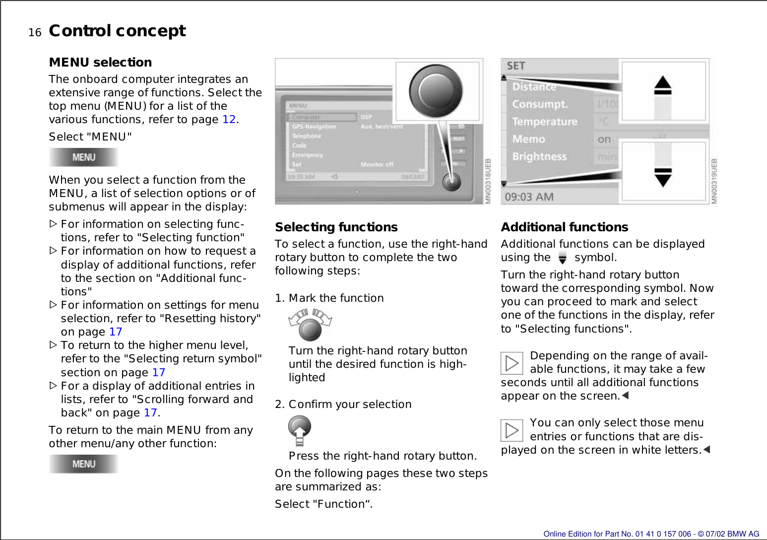
The BMW MK4 infotainment system has what I call “chip widgets”. Each widget that can be scrolled to as a wider “chip” that’s placed on the edge of the screen. Conceptually, a user is supposed to see the quadrants of the chips touching the edge of the screen and realize that the knob-turn cycles amongst all chips touching the edge of the screen.
BMW 2004 Nav System Owners Manual
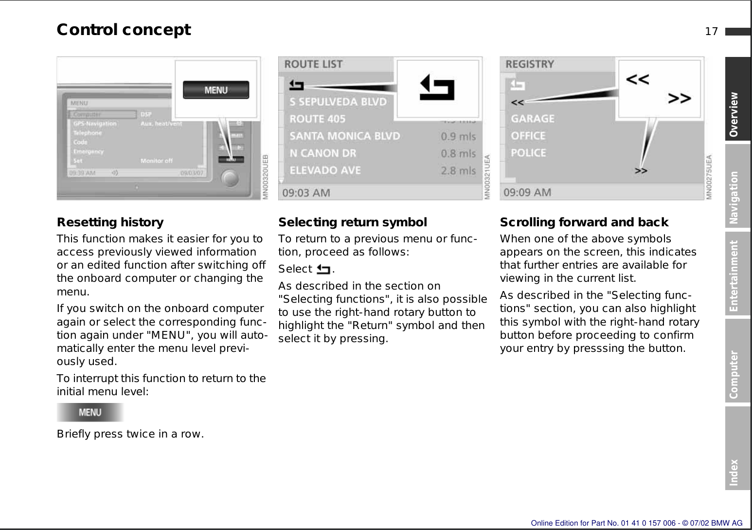
Any screen that can be navigated to with the navigator doesn’t necessarily have to contain Chip Widgets, it can contain regular Jetpack Compose widgets like this:
Each of these is clickable with a mouse, but we don’t have a mouse (or keyboard) in the car.
However, when I started writing this HMI in 2021, Jetpack Compose for desktop didn’t support keyboard Tab-Focus. Some projects out there listen for knob events and inject XF86 keyboard events to simulate tab focus changes.
I didn’t fully know how to solve this problem in 2021, so I started by just writing Composables that looked like BMW widgets, but didn’t have any actions or logic.
@Composable
fun MenuItem(
    boxModifier : Modifier = Modifier.fillMaxWidth(),
    label : String = " ",
    labelColor : Color = ThemeWrapper.ThemeHandle.current.colors.TEXT_WHITE,
    chipOrientation: ItemChipOrientation = ItemChipOrientation.NONE,
    isSelected: Boolean = false,
    isSmallSize : Boolean = false,
    onClicked : () -> Unit
) { ... }
The chipOrientation is a compass direction (N, S, E, W, NW, NE, SW, SE) that indicates which edge of the item should be wider so that it looks like a chip.
Produce State
The next thing I learned about was the produceState side-effect in Compose.
My input for knob events was @Named(ApplicationModule.INPUT_EVENTS) val inputEvents : SharedFlow<InputEvent>,
and I somehow needed to turn that into Composables where isSelected is set (somehow), and onClicked is called
(somehow) when a KnobClick event comes in when isSelected is true.
I remembered from my university Lisp course the beauty of homoiconicity. In Lisp, your data is code, and your code is data.
Here’s a toy example:
// Code
(defun text (t) (print t))
(defun bold (t) ((text "<b>") (text t) (text "</b>") )

//Data
(set a `((text "Hello") (bold "Bolded Name")))

// Code-as-data
// eval a
I didn’t quite have the beauty of S-expressions here, but the same ideas were swirling around my head.
I knew that once I converted the data into code (which then had to be executed within another @Composable),
I wouldn’t be able to update the state for a particular TextMenuItem. So, I had to be intentional with
having the data representation.
interface MenuItem {
    val isSelectable : Boolean
    val isSelected : Boolean
    val onClicked : () -> Unit

    fun toView(
        boxModifier: Modifier = Modifier.fillMaxWidth(),
        chipOrientation: ItemChipOrientation
    ): @Composable () -> Unit

    fun copyAndSetIsSelected(isSelected: Boolean): MenuItem {
        return when (this) {
            is TextMenuItem -> this.copy(isSelected = isSelected)
            is CheckBoxMenuItem -> this.copy(isSelected = isSelected)
            is ImageMenuItem -> this.copy(isSelected = isSelected)
            else -> error("Unsupported type")
        }
    }
}


data class TextMenuItem(
    val title : String,
    val labelColor : Color? = null,
    override val isSelectable : Boolean = true,
    override val isSelected : Boolean = false,
    override val onClicked : () -> Unit
) : MenuItem {
    override fun toView(boxModifier : Modifier, chipOrientation: ItemChipOrientation): @Composable () -> Unit = {
        // Same name as the MenuItem interface, but this is the composable function, not the interface
        // that TextMenuItem implements.
        MenuItem(
            boxModifier = boxModifier,
            label = title,
            chipOrientation = chipOrientation,
            labelColor = labelColor ?: ThemeWrapper.ThemeHandle.current.colors.TEXT_WHITE,
            isSelected = isSelected,
            onClicked = onClicked
        )
    }
}
I then realized that a List<TextMenuItem> is pretty much all the data we need to make a static menu. From that, I realized that a Flow<List<TextMenuItem>> is an interactive menu. If only there was a way to make Flow<List<TextMenuItem>> produce a state whenever the INPUT_EVENTS channel has an event.
class KnobListenerService @Inject constructor(
    @Named(ApplicationModule.INPUT_EVENTS) val inputEvents : SharedFlow<InputEvent>,
) {
    @Composable
    inline fun <reified T> listenForKnob(
        /** This is the list data the knob will scroll through */
        listData : List<T>,

        /** This is a lambda that is applied to each item in the list
         *  marking that is selected. Return the item with the appropriate
         *  flag set so that the UI can know it's selected.
         */
        crossinline onSelectAdapter : (item : T, isNowSelected : Boolean) -> T,

        /** This is a lambda that is applied to the item if we need to ask it
         *  if it is selectable.
         */
        crossinline isSelectableAdapter : (item : T) -> Boolean,

        /** This is a lambda that's called with an item when we've decided it's
         * been clicked. Users of the listenForKnob should call the onClicked function
         * for the item, whatever it's called.
         */
        crossinline onItemClickAdapter : (item : T) -> Unit

        ) : State<SnapshotStateList<T>> { ... }
}
Think of this as taking a List<T>, which is List<TextMenuItem>, and doing an rxJava zip operator with the input_events flow. We can then take the State<SnapshotStateList<T>> that this method makes, subscribe to it in an Composable, which gets us a SnapshotStateList<TextMenuItem>. Then, we call .value.forEach { it.toView() } in a Composable. We’ll discover shortly why the adapters are needed.
Putting it together in a single column
Before diving into exactly how the “conceptual zip” works, let’s zoom out and see
how this listenForKnob is meant to be used.
Let’s put it together in a single column reactive list Composable.
@Composable
    fun OneColumn(
        items : List<MenuItem>,
        alignment: Alignment.Horizontal = Alignment.Start,
        fullWidth : Boolean = false
    ) {

        //This will be called below. It's an inline lambda that runs in a ColumnScope
        //so that `alignment` and `fullWidth` can configure whether `OneColumn` spans the whole screen,
        //or whether it's a 1-column list half-width on the left or right side.
        val columnContents : @Composable ColumnScope.() -> Unit = {

                val colItems = MenuWindow.MenuWindowKnobListener.current.listenForKnob(
                        listData = items,

                        onItemClickAdapter = { it.onClicked() },
                        onSelectAdapter = { item, isNowSelected ->
                            when (item) {
                                is TextMenuItem -> item.copy(isSelected = isNowSelected)
                                is CheckBoxMenuItem -> item.copy(isSelected = isNowSelected)
                                is ImageMenuItem -> item.copy(isSelected = isNowSelected)
                                else -> error("Unsupported type")
                            }
                        },
                        isSelectableAdapter = { it.isSelectable }
                    ).value // This .value causes colItems to be conceptually
                    //(but not actually) a Flow<TextMenuItem> that is emitted
                    //with isSelected = true for the one item that is selected,
                    //every time the knob turns. (as well as onClicked behaviour)

                for (item in colItems) {
                    item.toView(
                        chipOrientation = if (!item.isSelectable) {
                            ItemChipOrientation.NONE
                        } else {
                            if (alignment == Alignment.Start) ItemChipOrientation.W else ItemChipOrientation.E
                        },
                    )() // By virtue of being called in a ColumnScope, every Composable
                    //will be placed in below the preceding.
                }
            }


        Box (
            Modifier
                .background(ThemeWrapper.ThemeHandle.current.colors.menuBackground)
                .fillMaxWidth()
        ){
            Row(Modifier.fillMaxWidth().wrapContentHeight(),
                horizontalArrangement = if (alignment == Alignment.Start) Arrangement.Start else Arrangement.End
            ) {
                if (fullWidth) {
                    Column(Modifier.weight(1F, true)) { columnContents() }
                } else {
                    Column(Modifier.weight(0.5f, true)) {
                        if (alignment == Alignment.Start) {
                            columnContents()
                        } else {
                            MenuItem.SPACER
                        }
                    }
                    Column(Modifier.weight(0.5f, true)) {
                        if (alignment == Alignment.End) {
                            columnContents()
                        } else {
                            MenuItem.SPACER
                        }
                    }
                }
            }
        }
    }
Let’s zoom out once more and see how a screen uses this.
    override fun provideMainContent(): @Composable (incomingResult: Navigator.IncomingResult?) -> Unit = {
        Column {
            BmwSingleLineHeader("Debug -> Keyboard")

            val enteredText = remember { mutableStateOf("") }

            HalfScreenMenu.OneColumn(
                fullWidth = true,
                items = listOf(
                    TextMenuItem(
                        title = "Go Back",
                        onClicked = { navigationNodeTraverser.goBack() }
                    ),
                    TextMenuItem(
                        title = "Entered: ${enteredText.value}",
                        isSelectable = false,
                        onClicked = {}
                    )
                ) + Keyboard.KeyboardType.values().map {
                    TextMenuItem(
                        title = "Open Keyboard Type ${it.name}"
                    ) {
                        modalMenuService.showKeyboard(it, "") { text -> enteredText.value  =text }
                    }
                }
            )
        }
    }
Into the innards of ListenForKnob
Let’s zoom all the way back in and see how ListenForKnob magically does this “zip”.
First, let’s become acquainted with our knob events:
sealed class InputEvent {
    ...
    object NavKnobPressed : InputEvent()
    data class NavKnobTurned(val clicks : Int, val direction : Direction) : InputEvent() {
        enum class Direction { LEFT, RIGHT }
    }
Next, we need circular lists. Cirkle provides this. It let’s us pick list indices with wraparound. If we’re at the end of the list, and get a click to the right, we want to wrap right to the beginning. (and similarly, past the beginning in both directions, by the magnitude of clicks modulo.)
This lets us write
val offset = if (event !is InputEvent.NavKnobTurned) { 0 } else {
    event.clicks * (if (event.direction == InputEvent.NavKnobTurned.Direction.RIGHT) 1 else -1)
}
Next, we need to realize the produceState API is handy for collecting flows and emitting to the state.
@Composable
fun something() : State<Foo> {
    produceState(someKey, someOtherKey) {
        // someFlow is Flow<Foo>
        someFlow.collect {
            value = it //Every time you call the value setter, the composable emits.
        }
    }
}
Putting it together,
@Composable
    inline fun <reified T> listenForKnob(
        /** This is the list data the knob will scroll through */
        listData : List<T>,

        /** This is a lambda that is applied to each item in the list
         *  marking that is selected. Return the item with the appropriate
         *  flag set so that the UI can know it's selected.
         */
        crossinline onSelectAdapter : (item : T, isNowSelected : Boolean) -> T,

        /** This is a lambda that is applied to the item if we need to ask it
         *  if it is selectable.
         */
        crossinline isSelectableAdapter : (item : T) -> Boolean,

        /** This is a lambda that's called with an item when we've decided it's
         * been clicked. Users of the listenForKnob should call the onClicked function
         * for the item, whatever it's called.
         */
        crossinline onItemClickAdapter : (item : T) -> Unit

        ) : State<SnapshotStateList<T>> {

        val logger = DaggerApplicationComponent.create().logger()

        val stateListOf = mutableStateListOf(*listData.toTypedArray())

        return produceState(initialValue = stateListOf, listData) {

            //The extra layer of indirection for a list of indices that is made circular
            //is needed. You could try and make listData be listData.circular(),
            //but you still have to skip over the non-selectable list items while
            //showing them.
            val selectedListIndices = stateListOf
                .mapIndexed { index, t -> index to t }
                .filter { isSelectableAdapter(it.second) }
                .map { it.first }
                .circular()
            var selectedIndex : Int = 0

            //Pre-select the first selectable item
            stateListOf.indexOfFirst { isSelectableAdapter(it) }.let { index ->
                if (index != -1) {
                    selectedIndex = index
                    stateListOf[index] = onSelectAdapter(stateListOf[index], true)
                    value = stateListOf
                }
            }

            inputEvents
                .collect { event ->

                val offset = if (event !is InputEvent.NavKnobTurned) { 0 } else {
                    event.clicks * (if (event.direction == InputEvent.NavKnobTurned.Direction.RIGHT) 1 else -1)
                }

                val oldSelectedIndex = selectedIndex
                stateListOf[selectedListIndices[oldSelectedIndex]] =
                    onSelectAdapter(stateListOf[selectedListIndices[oldSelectedIndex]], false)

                selectedIndex = oldSelectedIndex + offset
                stateListOf[selectedListIndices[selectedIndex]] =
                    onSelectAdapter(stateListOf[selectedListIndices[selectedIndex]], true)

                value = stateListOf

                if (event is InputEvent.NavKnobPressed) {
                    onItemClickAdapter(stateListOf[selectedListIndices[selectedIndex]])
                }
            }
        }
    }
Beyond a single column list
A single column list is easy to build. Put your menu item data into a List<MenuItem>, “call it in a column scope”.
What do you do if you want a two column screen, or a quandrant screen?
    @Composable
    fun TwoColumnFillFromTop(
        leftItems : List<MenuItem>,
        rightItems : List<MenuItem>
    )

    @Composable
    fun TwoColumnFillFromCorners(
        nw : List<MenuItem>,
        ne : List<MenuItem>,
        sw : List<MenuItem>,
        se : List<MenuItem>
    )
Each of the sub-lists need to be conjoined into one circular list for item selection purposes, then split back up into their component lists, so that each smaller list can be toView()‘d within the right parts of the UI.
How do we conjoin, and then split back up into the right small lists? We need to keep track of where the item originally came from, and what position it was in it’s source list.
internal class ConjoinedListRecord<I, P>(
    val item : I,
    val sourcePlacementEnum : P, //LEFT or RIGHT, or a quadrant
    val originalItemPosition : Int //Original index in placement
) : SnapshotTriple<I, P, Int>(item, sourcePlacementEnum, originalItemPosition)
As an aside, a SnapshotTriple is something I had to write so that ConjointListRecord is a StateObject so that an update of any part of the SnapshotTriple causes Compose to notice and recompose. Compose only recomposes when StateObjects change. A common source of bugs is using a List<T> in Compose and not seeing the display update when the list contents changes. Instead you’re supposed to use a SnapshotStateList.
internal open class SnapshotTriple<A, B, C>(
    val first : A,
    val second : B,
    val third : C
) : StateObject {
    val backingList = mutableStateListOf(first, second, third)
    override val firstStateRecord: StateRecord
        get() = backingList.firstStateRecord

    override fun prependStateRecord(value: StateRecord) {
        backingList.prependStateRecord(value)
    }

    operator fun component1() : A = first
    operator fun component2() : B = second
    operator fun component3() : C = third
    override fun toString() =
        "SnapshotTriple(first = $first, second = $second, third = $third)"
}
Making a Quadrant Menu
A great example of a Quadrant menu is the main menu:
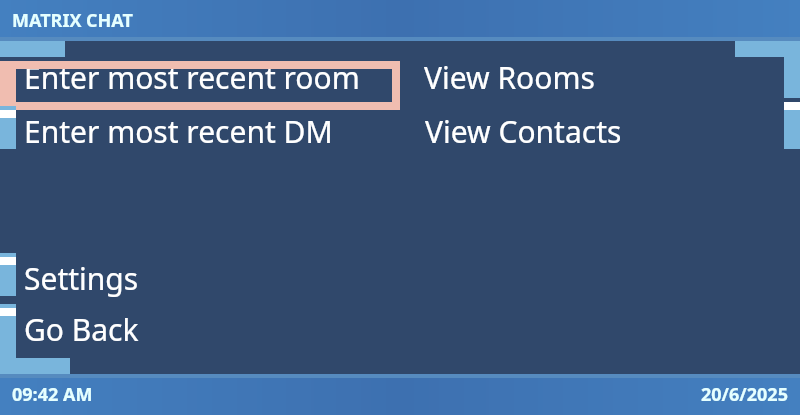
It is drawn by creating sublists:
Column(modifier = Modifier.fillMaxSize()) {

            BmwSingleLineHeader("Matrix Chat")

            FullScreenMenu.TwoColumnFillFromCorners(
                nw = listOf(
                    TextMenuItem("Enter most recent room", ...),
                    TextMenuItem("Enter most recent DM", ...)
                ),
                ne = listOf(
                    TextMenuItem("View Rooms", ...),
                    TextMenuItem("View Contacts", ...)
                ),
                sw = listOf(
                    TextMenuItem("Settings", ...),
                    TextMenuItem("Go Back", ...)
                ),
                se = listOf(
//                    TextMenuItem("New Chat", ...),
//                    TextMenuItem("New Room", ...)
                )
            )
        }
With that, the conjoining and deconjoining logic practically writes itself :)
@Composable
fun TwoColumnFillFromCorners(
    nw : List<MenuItem>,
    ne : List<MenuItem>,
    sw : List<MenuItem>,
    se : List<MenuItem>
) {

    //We combine each list into a super-list
    //that behaves as one, so that scrolling
    //spans all quadrants

    val circularList = mutableListOf<ConjoinedListRecord<MenuItem, QuadrantListItemSource>>().apply {
        if (nw.isNotEmpty()) {
            add(ConjoinedListRecord(nw[0], QuadrantListItemSource.NW, 0))
        }

        addAll(ne.mapIndexed { index, menuItem ->
            ConjoinedListRecord(menuItem, QuadrantListItemSource.NE, index)
        })

        addAll(se.mapIndexed { index, menuItem ->
            ConjoinedListRecord(menuItem, QuadrantListItemSource.SE, index)
        })

        addAll(sw.reversed().map { menuItem ->
            ConjoinedListRecord(menuItem, QuadrantListItemSource.SW, sw.indexOf(menuItem))
        })

        addAll(nw.drop(1).reversed().map { menuItem ->
            ConjoinedListRecord(menuItem, QuadrantListItemSource.NW, nw.indexOf(menuItem))
        })
    }

    val selectionOrderConjoinedList = remember(MenuWindow.MenuWindowKnobListener.current) { mutableStateOf(circularList) }

    val conjoinedList = MenuWindow.MenuWindowKnobListener.current.listenForKnob(
        listData = selectionOrderConjoinedList.value,
        onItemClickAdapter = { it.item.onClicked() }, //Adapter comes in clutch for using the ConjoinedListRecord
        onSelectAdapter = { item, isNowSelected ->
            ConjoinedListRecord(item.first.copyAndSetIsSelected(isNowSelected), item.second, item.third)
        },
        isSelectableAdapter = { it.item.isSelectable }
    ).value

    fun conjoinedListSliceForQuadrant(quadrantListItemSource: QuadrantListItemSource) : List<MenuItem> =
        conjoinedList
            .filter { it.sourcePlacementEnum == quadrantListItemSource }
            .sortedBy { it.originalItemPosition }
            .map { it.item }

    fun List<MenuItem>.toViews(quadrantListItemSource: QuadrantListItemSource) : @Composable () -> Unit = {
        forEachIndexed { index, menuItem -> menuItem.toView(
            chipOrientation = if (!menuItem.isSelectable) {
                ItemChipOrientation.NONE
            } else {
                when (quadrantListItemSource) {
                    QuadrantListItemSource.NW -> if (index == 0) ItemChipOrientation.NW else ItemChipOrientation.W
                    QuadrantListItemSource.NE -> if (index == 0) ItemChipOrientation.NE else ItemChipOrientation.E
                    QuadrantListItemSource.SW -> if (index == lastIndex) ItemChipOrientation.SW else ItemChipOrientation.W
                    QuadrantListItemSource.SE -> if (index == lastIndex) ItemChipOrientation.SE else ItemChipOrientation.E
                }
            })()
        }
    }

    Box(
        Modifier.background(ThemeWrapper.ThemeHandle.current.colors.menuBackground)
            .fillMaxWidth()
            .fillMaxHeight()
    ) {

            Row(Modifier.fillMaxWidth().wrapContentHeight().align(Alignment.TopCenter)) {
                Column(Modifier.weight(0.5F, true)) {
                    conjoinedListSliceForQuadrant(QuadrantListItemSource.NW).toViews(QuadrantListItemSource.NW)()
                }
                Column(Modifier.weight(0.5F, true)) {
                    conjoinedListSliceForQuadrant(QuadrantListItemSource.NE).toViews(QuadrantListItemSource.NE)()
                }
            }

            Row(Modifier
                .fillMaxWidth()
                .wrapContentHeight()
                .align(Alignment.BottomCenter),
                verticalAlignment = Alignment.Bottom
            ) {
                Column(Modifier.weight(0.5F, true)) {
                    conjoinedListSliceForQuadrant(QuadrantListItemSource.SW).toViews(QuadrantListItemSource.SW)()
                }
                Column(Modifier.weight(0.5F, true)) {
                    conjoinedListSliceForQuadrant(QuadrantListItemSource.SE).toViews(QuadrantListItemSource.SE)()
                }
            }

    }
}